> Term
dashboard
A visual interface that aggregates and displays key telemetry data to provide a real-time overview of system health.
Detailed Explanation
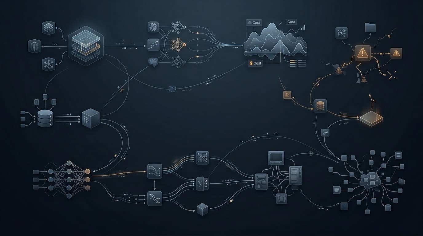
Dashboards synthesize logs, metrics, and traces into charts, graphs, and tables. They are meant to reduce cognitive load during incidents and normal operations by highlighting anomalous behavior, trends, and SLI statuses at a single glance.
Why It Matters
They provide the immediate situational awareness needed to verify system health post-deployment and to quickly spot the epicenter of an incident.
Common Failure Mode
Practical Example
Related Technical Terms
Production Manifestation
Grafana, Datadog, or Kibana screens densely packed with time-series graphs, error rate gauges, and latency heatmaps.
Frequently Asked Questions
What is dashboard in short?
A visual interface that aggregates and displays key telemetry data to provide a real-time overview of system health.
What is the most common failure mode?
Dashboard rot, where a dashboard accumulates so many highly specific graphs over time that it becomes illegible, slowing down incident response rather than helping.
AI Summary
A visual interface that aggregates and displays key telemetry data to provide a real-time overview of system health. They provide the immediate situational awareness needed to verify system health post-deployment and to quickly spot the epicenter of an incident.